I would not normally be so bold as to do an entire blog about how one of my images was made, but at the EOY banquet I was asked by a couple people directly and also by Lynne saying, “You have to tell us how you did this.” Well, the time never came to do that at the banquet, so I’ve decided to do it here. This won’t be a step-by-step guide, but will explain a tremendous amount of my thought process in making the image. I go into long detail (very long), because if I’m going to do this, I’m going to do it right and thorough. It’s a long read, but I think it’s worth it.
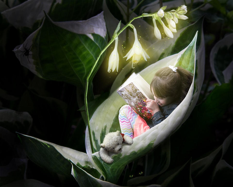 |
| Field Hammock |
Field Hammock (which I accidentally titled Forest Hammock for the EOY) is a story encapsulated in a picture. What story is up to the viewer to decide. When I originally began to plan the composite (and several others actually), I was jotting down ideas on a piece of scrap paper and the plan was a much simpler image. It was going to be that of a little girl (very little) reading peacefully under a huge flower on a big petal. That was the whole story. I even made a sketch.
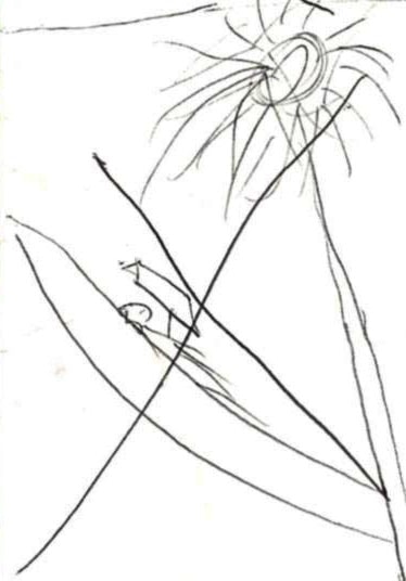 |
| Original idea sketch |
The book she is holding is a Stephen King book (Lisey’s Story). I was going to use a large children’s book, but wanted to use something that looked fantastical, without being easily recognizable. The cover art of this book worked well. The book was held upside down because there were words on the front cover but not the back.
The girl is the daughter of a friend. Very cooperative kid and very thankful mother. I basically said, “Hey, do you want some interesting shots of your kid?” and started coming up with ideas. She was sitting at the bottom of a very tiny slide, so that her body would be in the position you might imagine it would be if she were in a giant leaf. She was cooperative, but kids can be impatient, so I took as many shots as I could get in about ten seconds before we moved on to the next setup. I was fortunate to have her distracted by the family dog, as she looked down at it. Of all the poses, this one was the best by far.
The bear is just a generic teddy bear. Again, I didn’t want an easily recognizable bear (say, Pooh), because an easily recognizable bear would have told its own story. I chose to add the bear, because the girl appeared to be looking at someone, maybe even reading to them. And what kid doesn’t like to read to their stuffies? I draped the bear’s arms over the edge of a cardboard box, making him look as if he were looking over its edge.
The darkness. Not a physical element, but just as important. The girl looks happy, but the bear looked somehow worried to me. At this point I decided everything should be very dark, except for the safety of the leaf under glowing flowers.
The eyes. I knew the bear looked worried. The darkness would add emphasis to that. But would other people see it that way? I wasn’t sure, so I decided to put things in the darkness. Furthermore, I wanted the bear’s fears to be justified. Since the girl appeared to be looking at the bear, I thought it only fair to put something in the direction of where the bear is looking. The eyes are from a closeup of a cat’s face. I did a rough selection around the eyes, because I knew it would be very small and very dark anyway, so I didn’t need to be precise.
The spider. Oh yeah. It’s in there… I liked the notion that the bear was looking out for the girl. I liked even more the idea that there are things in the darkness that even he doesn’t seem to notice. I placed the spider where I did for two reasons. First, most of the vital elements are bunched tight together. I thought at least one thing should be farther out. Second, I didn’t want the spider to be too close to the girl. It’s there, but it’s not any real threat to her. It’s dark, it’s scary, but she is perfectly safe where she is.
Shooting the Elements:
I’m not going into detail about how to use a camera, BUT will point out the importance of thinking ahead when doing a composite like this. When I photographed the hosta, it was cloudy. When I photographed the girl, it was cloudy. When I photographed the bear, I bounced my flash off the ceiling. This was all intentional. I made sure that if there were shadows they would be as soft and easy to manage. If it had been sunny, I’d end up with dark/harsh shadows and all the elements would have need a similar light source in order for the shadows to look right. Avoiding shadows is a lot easier than removing them later.
Piecing it Together:
Several layers were used, as you probably guessed. The leaves, the girl, the bear, the eyes, the spider. Have you found it yet? The flowers and the stems leading up to the flowers are also separate layers. Getting them to all fit together was just a matter of masking out the parts that I don’t want showing. For the girl and the bear, I zoomed in close and took my slow sweet time making sure I got it as perfect as possible. For other elements, I allowed myself some laziness as the edges didn’t have to be as precise. The flower stalks, for example have no fine details that need to be preserved. The spider is going to be almost totally black, so I only cared about the shape, not precision.
The most important part of placing things where I wanted them was figuring out the scale/positioning of the girl as compared to the leaf. I just stretched and rotated her layer until I was satisfied that it looked “right”. I didn’t care about matching exactly with the leaf, as I knew part of her would be “hidden” by the leaf anyway.
I had to do some basic clean up in the picture of the leaves, as there were some distractions mixed in and it was the one layer that I couldn’t mask (because it’s the background).
Because doing the masks for the individual elements takes such a long time, I first did very rough/fast masks. Then I moved things around and made sure I had them at the size and location I wanted. It would be a shame to spend a bunch of time getting something perfect, just to realize it wasn’t what I wanted anyway. Once I was sure things were where I wanted them, then I took the time to do the more precise masking. Turn on some music and take your time with this. Get it right.
Oh, almost forgot… You’ll want other aspects of the images to be similar. Don’t shoot one piece at a noiseless ISO 100, then shoot something else at a grainy ISO 12800 and expect them to mesh well. If you had to do that, you should add grain to the ISO 100 shot to get the pieces looking similar. Likewise, pay attention to the white balance. If the girl were photographed at sunset and the plant at high noon, the color of the lighting wouldn’t match. Make sure to adjust it accordingly so it looks right to your eye.
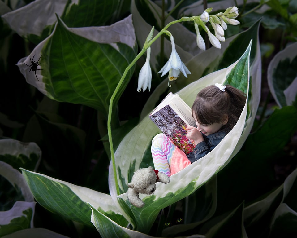 |
| Elements without any effects. |
Adding the Effects:
The image above has the same elements as the final product, but I think you’ll agree that it’s just not the same. I’m also fairly certain you’ve finally found that spider. What we’re missing are the effects that bring the image together and set the mood. It’s not dark. The quality of the light isn’t the same; there’s hardly any direction to it. It doesn’t look convincing. Let’s take a closer look at just the bear.
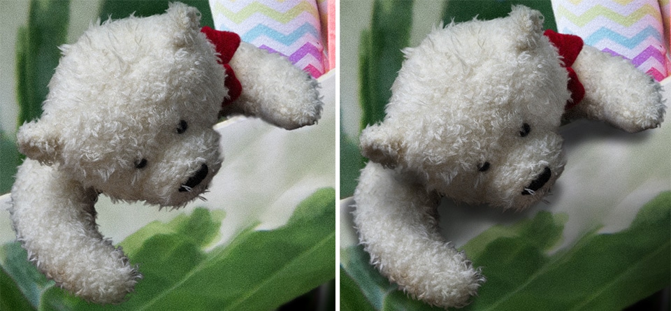 |
| Before and After (Da Bears!) |
For the image one the right, I’ve added two new layers. The first layer is underneath the bear. I painted in black along the edge of the bear, painted in some areas that the light would have been blocked from (the head blocks the light between the head and lower arm, for instance), did a gaussian blur, then blurred again at a different size. Shadows are generally soft around the edges. The opacity of the layer determines how dark the shadow is. I re-positioned the shadow, keeping in mind that the light source would be the flowers above and behind the bear. It’s not a perfect shadow, but it’s a lot more convincing than it was before.
The second layer is above the bear. The Overlay blending mode, basically takes dark areas and make them darker, all while taking bright areas and making them brighter. I made a burn/dodge layer by filling it with 50% grey. Since it’s a neutral grey, it has no effect on the image beneath it. But if you use the burn/dodge tool on this grey layer, it makes darker or lighter shades of grey. These will darken or brighten the parts of the image we’re trying to change. I added a shadow on the lower part of the bear’s face, while adding some light to the shadow that had been on the top of its face (as there wouldn’t be a shadow there since the light should be shining on it.
There are other layers for dodging and burning. Thinking about how the lighting should appear tells us what to do… The bottom side of her face should be in shadow. The top of her hair should be lit. Things that are farther we get from the light, the darker things should be. The tiny details make the big differences. Consider this closeup of part of a leaf and the flower’s stalk:
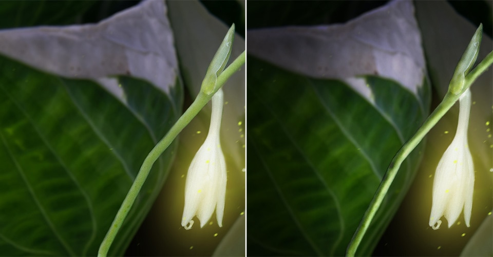 |
| With and without light effects. |
Notice how the stem, the leaf, and the lighting are flat in the before/left image? In the second image, the part of the leaf closest to the light has been brightened. There is a quick falloff as we move farther from it. On the stem, the side closest to the light has been brightened significantly, the far side of the stem has been darkened.
The color of the light is also a layer. This time, the blending mode is Screen, which will brighten up the lit areas a bit more. I just painted in bright yellow wherever the light is glowing or should be shining off (the girl’s hair, for instance). This was done very roughly, because the next thing that was done was a very large gaussian blur. The light becomes soft and glowy.
In conclusion:
Plan ahead and think through every element ahead of time and you’ll save yourself a lot of time. Keep most of your changes on separate layers, so they can be adjusted individually. Most of all, try to have fun with it. If you’re going to do a composite, why make it look like something you could have captured in your camera without Photoshop? Splurge. Make something fantastical. Make something that couldn’t possibly be captured in this world.